
Layout Manager
Choose the shell your client area sits in - where navigation lives, how the footer is built, and how wide content runs. Guests and signed-in clients can be given different layouts, and any page can override the lot.
Introduction
A layout is the frame around every page: the navigation, the footer, and the geometry between them. Hadrian ships six, in two independent kinds - three for the main menu and three for the footer - and you pick one of each. A fourth main-menu card, Topbar Minimal, ships as a working example of a custom layout - any folder your developer drops into the theme joins this page the same way.
Open Hadrian -> Layouts.

Main menu layouts
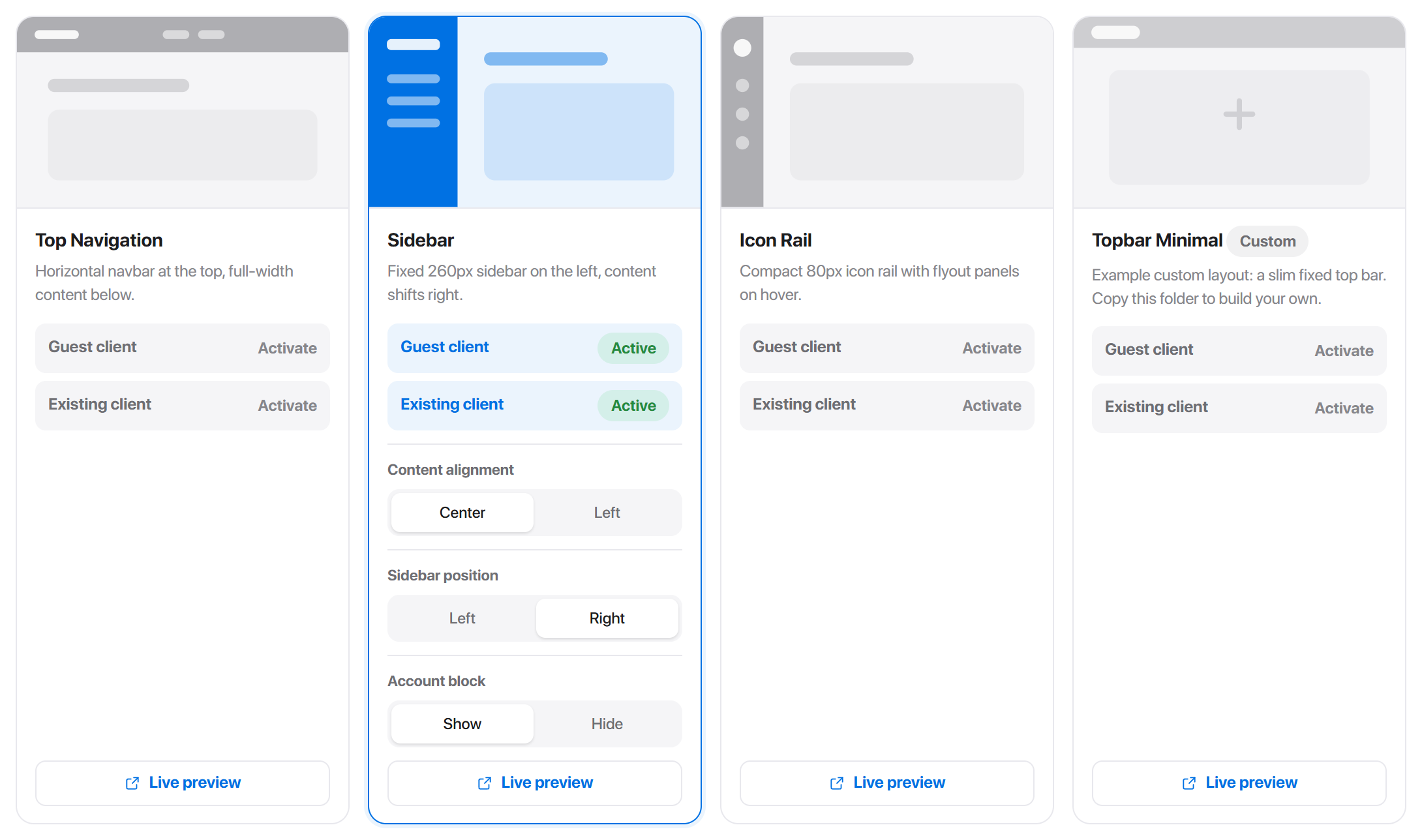
Each card carries a wireframe, a one-line description, its activation rows, and - once it is active - its options.
Top Navigation
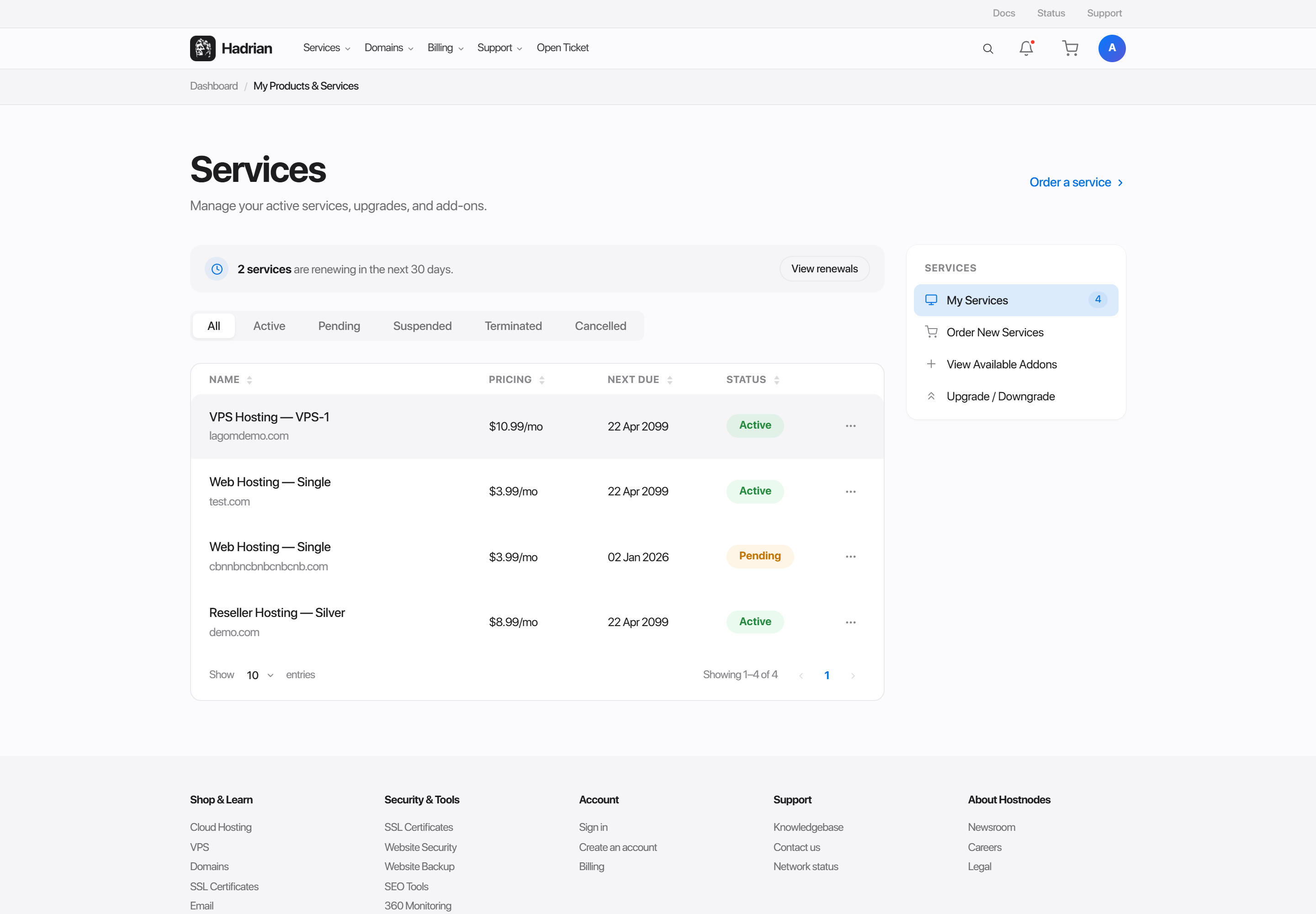
A horizontal navbar across the top with content full-width beneath it. No left column, so the content area gets the entire viewport width.
Best for accounts with few sections, and for installs where the client area sits alongside a marketing site that already has a top navbar.
Sidebar
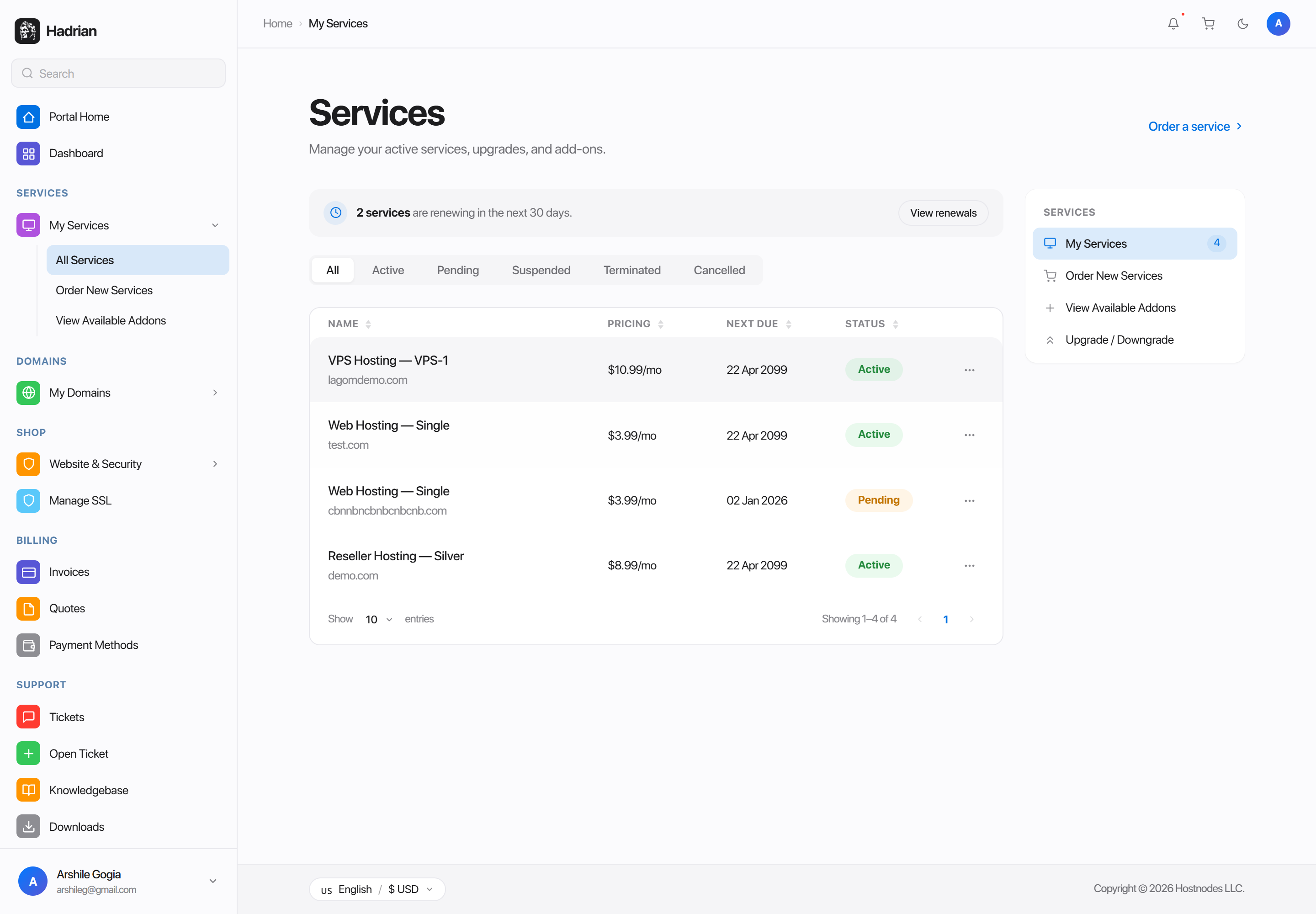
A fixed 260px column on the left holding the full navigation tree, with search, the section groups and the account block. Content shifts right by exactly that width.
The default, and the right choice for dense accounts - every section is one click away and stays visible while the customer works.
Icon Rail
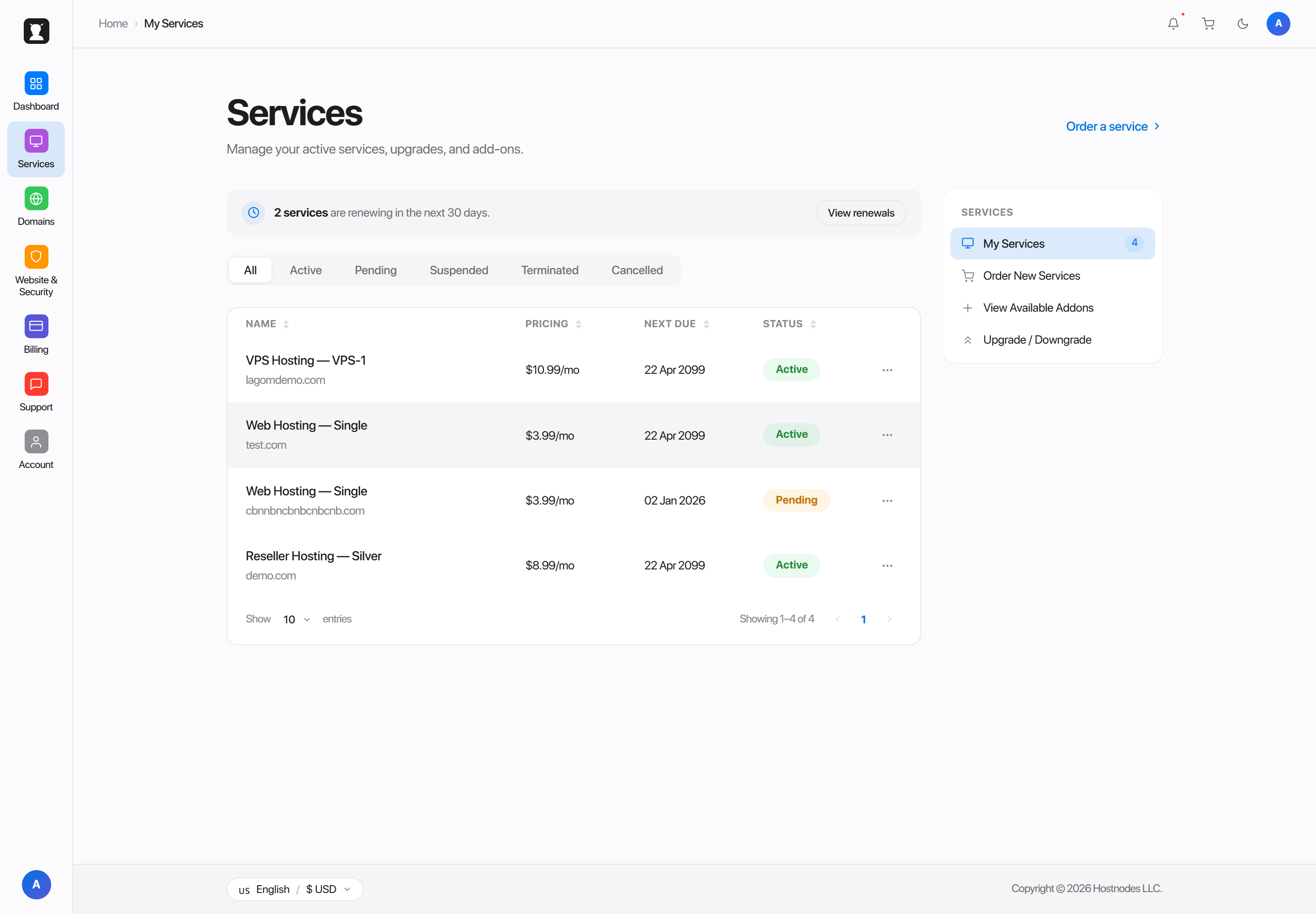
A compact 80px strip of icons. Hovering one opens a flyout panel with that section's links, overlaying the content rather than pushing it.
Best when you want the content area as wide as possible but still want persistent navigation. It costs a hover to read a label, so it suits confident, repeat users more than first-time visitors.
Guests and existing clients
Every layout has two independent activations, not one.
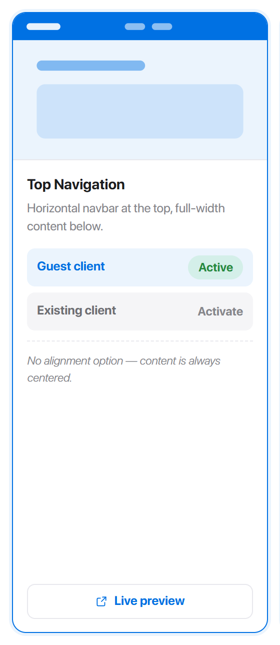
- Guest client - anyone not signed in.
- Existing client - anyone signed in.
Activating for one audience leaves the other untouched, so a marketing-style top nav for visitors and a dense sidebar for customers is a two-click setup. Hadrian decides which a visitor is from their session, before the page renders, so there is no flash of the wrong layout.
Per-layout options
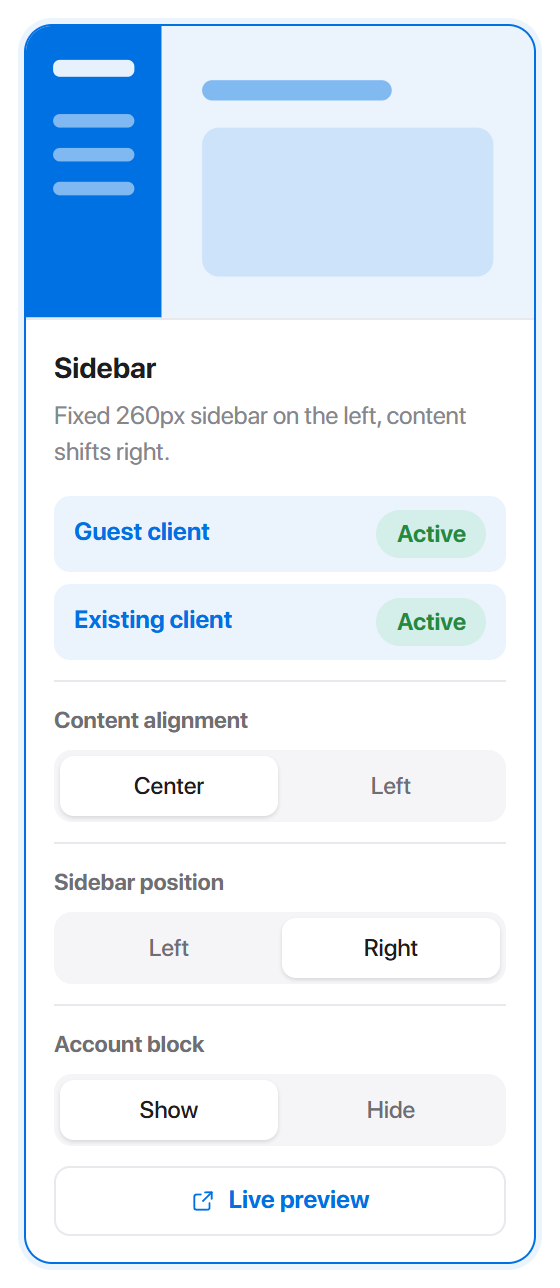
Sidebar and Icon Rail each offer three:
| Option | Choices | Default |
|---|---|---|
| Content alignment | Center, Left | Center |
| Sidebar position / Rail position | Left, Right | Left |
| Account block | Show, Hide | Show |
They are stored per layout, so the rail's position is independent of the sidebar's.
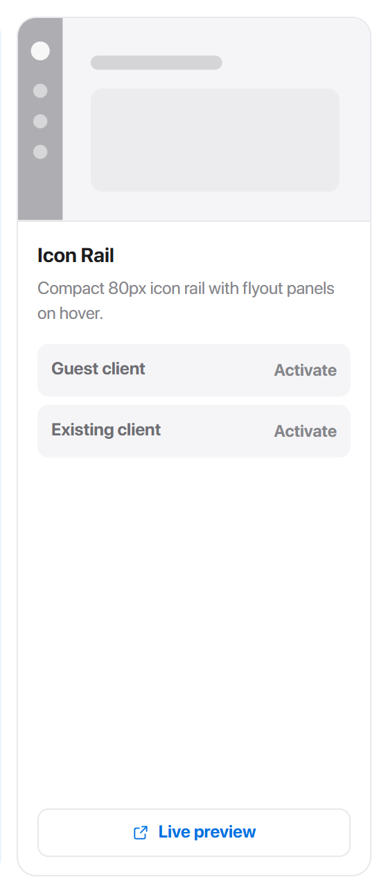
Every option's default emits nothing at all, so an untouched install renders exactly as it shipped.
Live preview
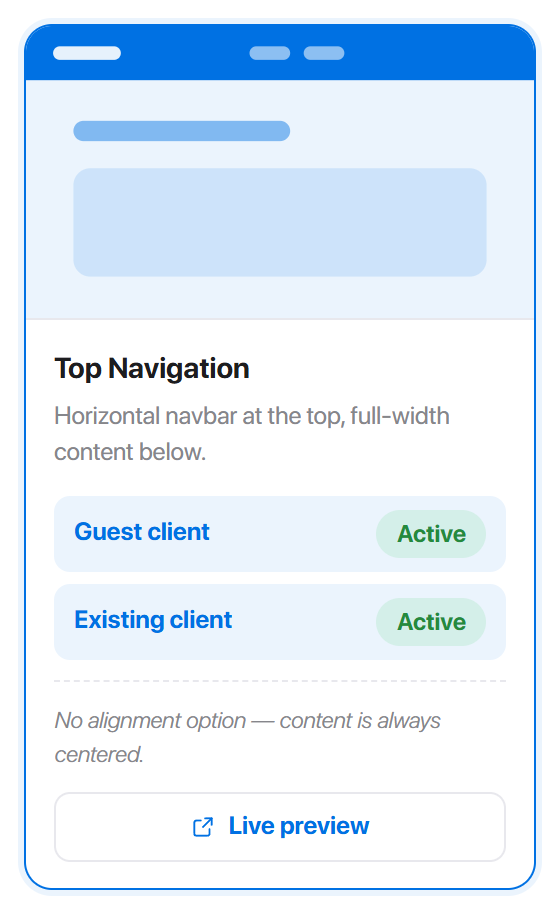
Live preview opens the client area with that layout applied for your browser session only. Customers keep seeing whatever is actually activated. It is the safe way to compare all three before committing.
The link is ?preview=1&layout=… on your own client area. Footer cards have no preview link - footers have no equivalent standalone mode to preview.
Footer layouts
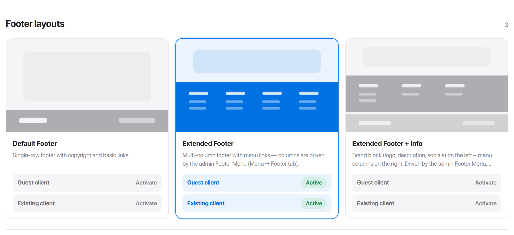
| Layout | What it renders | Driven by |
|---|---|---|
| Default Footer | A single row: copyright, a few links, the locale button | Footer Secondary Menu |
| Extended Footer | A multi-column site map above that row | Footer Menu - each top-level item becomes a column |
| Extended Footer + Info | The columns, plus a brand block with logo, description and social icons | Footer Menu, Branding, Footer Secondary Menu |
Footer layouts have no options of their own - what they show comes from the menus and from Branding.
Footer options
Two toggles sit below the footer cards, on the same tab.
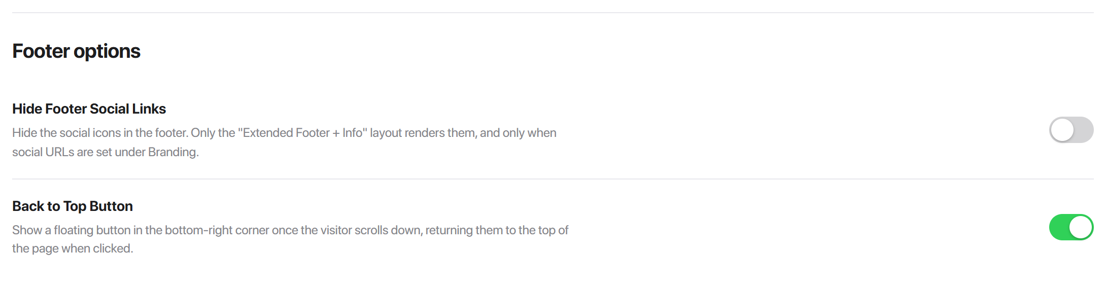
| Setting | What it does | Default |
|---|---|---|
| Hide Footer Social Links | Hides the social icons in the footer | Off |
| Back to Top Button | Shows a floating button in the bottom-right once the visitor scrolls down | Off |
Header
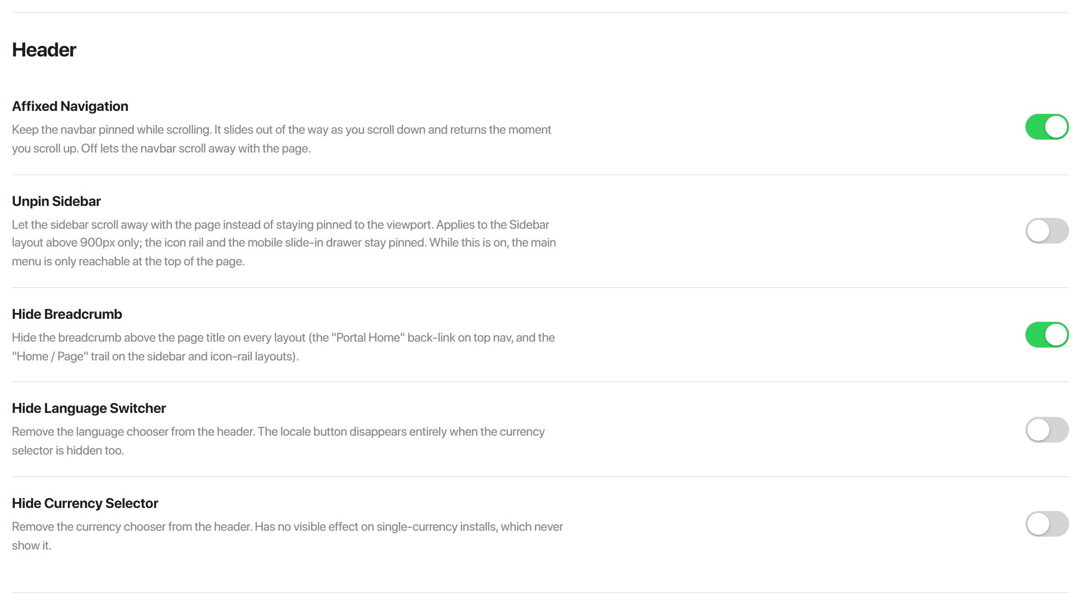
| Setting | What it does | Default |
|---|---|---|
| Affixed Navigation | Pins the navbar while scrolling. It slides away as you scroll down and returns the moment you scroll up | Off |
| Unpin Sidebar | Lets the sidebar scroll away with the page instead of staying put. Sidebar layout above 900px only | Off |
| Hide Breadcrumb | Removes the breadcrumb above the page title on every layout | Off |
| Hide Language Switcher | Removes the language chooser from the header | Off |
| Hide Currency Selector | Removes the currency chooser. No visible effect on single-currency installs | Off |
Containers
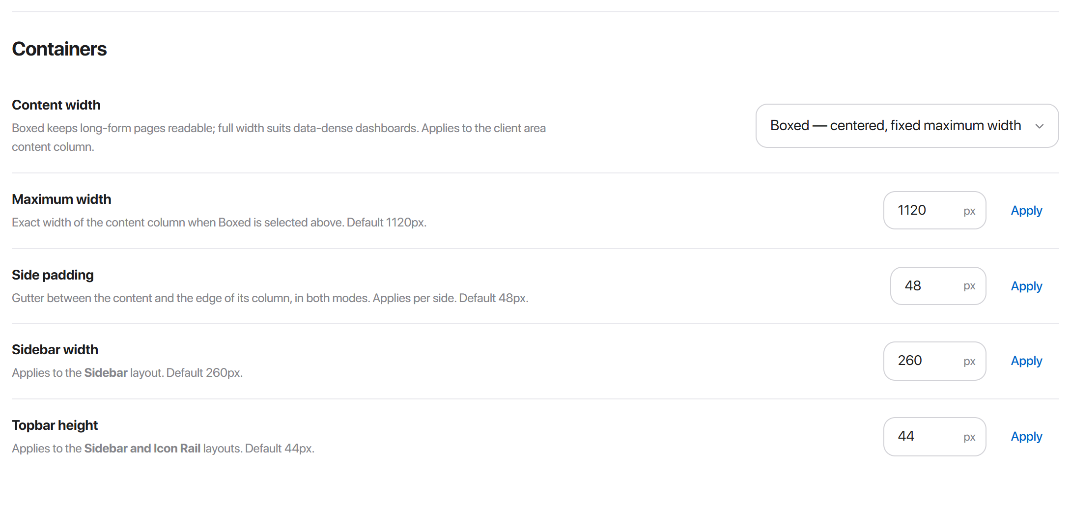
Content width is the mode: Boxed centres the content column at a fixed maximum, Full width uses the whole viewport. Boxed keeps long-form pages readable; full width suits data-dense dashboards.
| Setting | Default | Range |
|---|---|---|
| Maximum width | 1120px | 640-2400 |
| Side padding | 48px | 0-160 |
| Sidebar width | 260px | 0-4000 |
| Topbar height | 44px | 0-4000 |
Side padding applies per side, in both modes.
Overriding a layout for one page
Layouts are site-wide, but a single page can opt out. In Pages, open a page and find Custom layout:
- 1Open Hadrian -> Pages and pick the page.
- 2Under Custom layout, set Main menu or Footer to the layout you want.
- 3Leave either on - Inherit - to keep following the global setting.
A per-page override beats the global choice for that page, including the per-audience one. Useful for a checkout that should lose the sidebar, or a landing page that wants the extended footer when nothing else does.
Common problems
A layout's options are missing
Options only render on a card that is active for at least one audience. Activate it first, then the controls appear.
The layout changed for me but not for customers
You used Live preview, which is scoped to your browser session. Press Activate on the audience you want.
Maximum width does nothing
Content width is set to Full width, which ignores it. Switch to Boxed.
Guests and clients both changed when I only meant one
Only the layout choice is per-audience. Options, Header flags, Containers and Footer options are global - see the warning above.
One page ignores the layout entirely
It has a per-page override. Check Pages -> that page -> Custom layout and set both selects back to - Inherit -.
The footer has only one column
Extended Footer builds its columns from the Footer Menu's top-level items. Add more under Menu -> Footer.