
Page Templates
The three pages that ship more than one design, what each one renders, every setting they offer, and the block builder the dashboards share.
Introduction
Most pages in Hadrian have one design. Three do not: the Dashboard, the Homepage and the Sign in page each ship several, and you pick one per page and save.
This article is the catalogue. It shows what every template renders and documents every setting each one offers. Page Manager covers the screen itself - where the list is, how to activate a card, and the SEO, visibility and layout controls that apply to every page whichever template is on.
Where the settings live
One mechanic explains everything below, so it is worth reading once.
- Settings belong to a template, not to a page. Activate a different template and the Template settings panel changes with it, because those options are declared by the template you just chose.
- A template you are not using keeps its configuration. Hadrian stores each template's settings under its own name, so configuring Bento, running Minimal for a fortnight and switching back leaves Bento exactly as you left it.
- A few settings belong to the page and stay put whichever card is active. On Sign in there are three; on the Homepage all seven are page-scoped.
- The dashboards keep most of their settings inside the block builder, in each block's own drawer, rather than in the Template settings panel. The panel holds only what applies to the page as a whole.
Dashboard
The logged-in client home page. Four templates, all drawing the same data - your services, domains, invoices, tickets and announcements - in four different shapes.
Default
The shipped dashboard: alert strip, summary tiles and a panel grid. It has no settings of its own and no block builder; it is the arrangement WHMCS users will recognise.
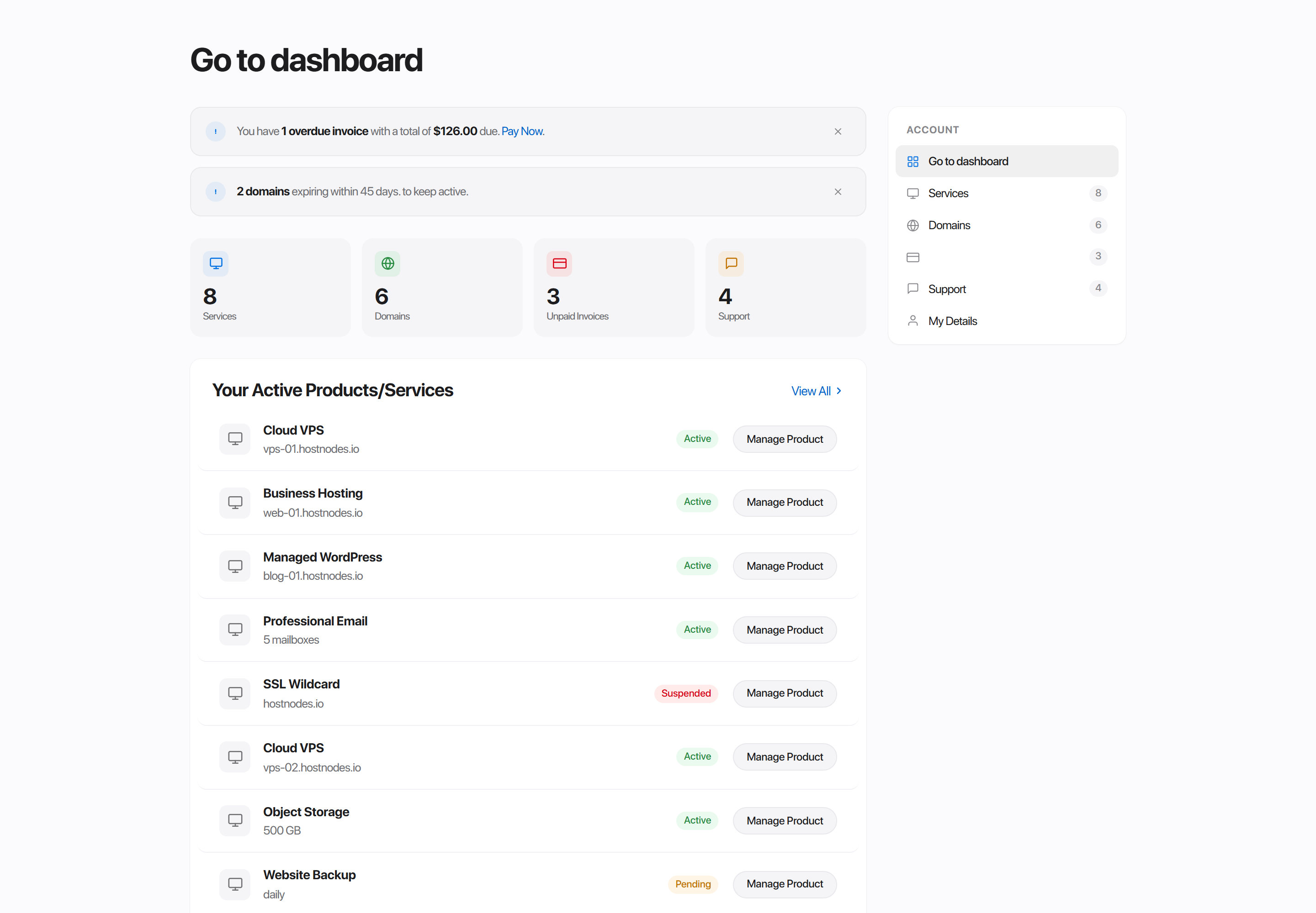
Atrium
A welcome band over four summary figures, then an asymmetric two-column body: the collections you read down the wide side, the things you act on down the narrow one.
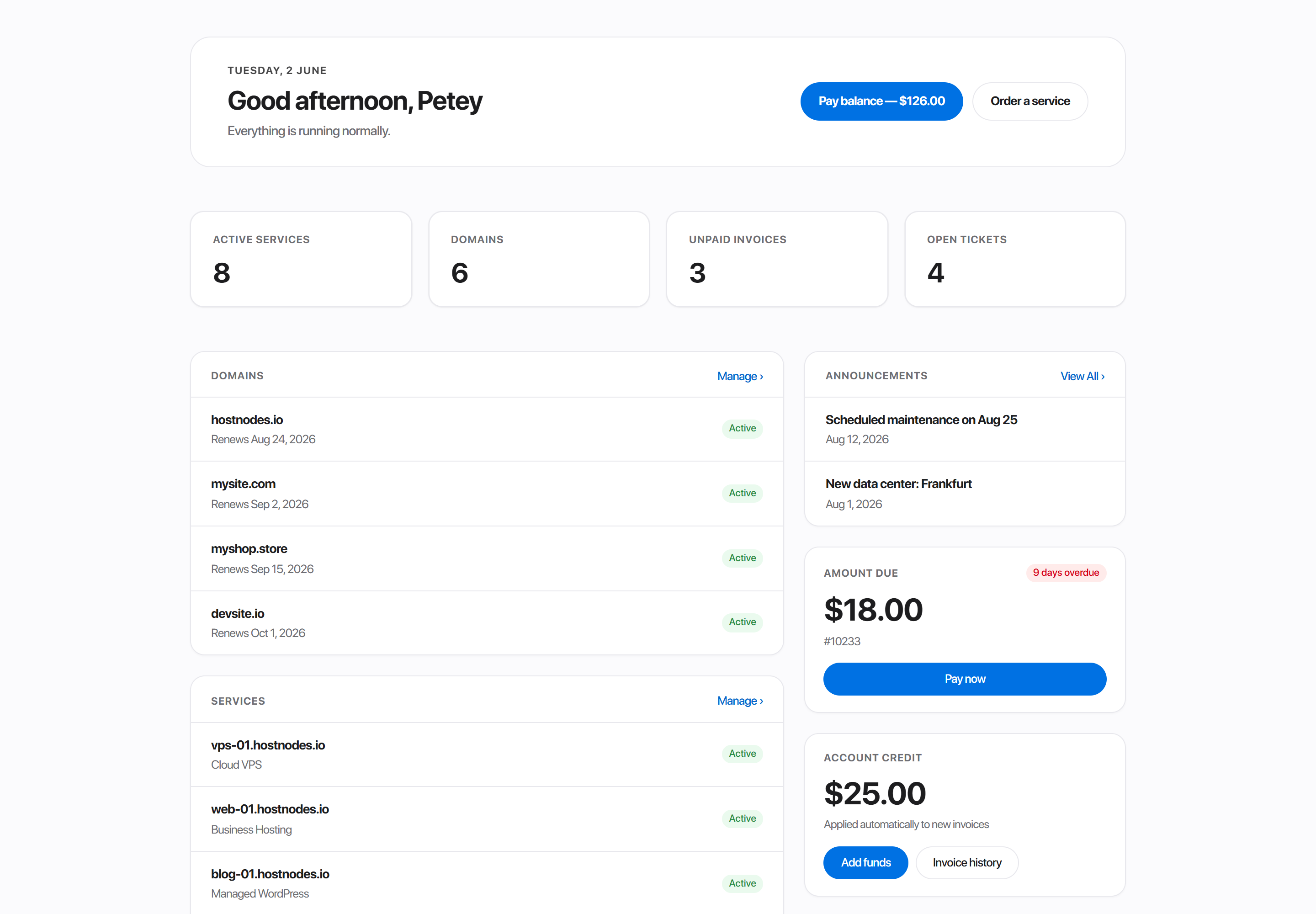
Atrium is the one to pick when the account has a lot of rows to read. Width here picks a column, not a size - see What width means.
Bento
A bento grid of self-contained cards. Each collection gets its own tile with a count and its rows, arranged two-up on a six-column grid.
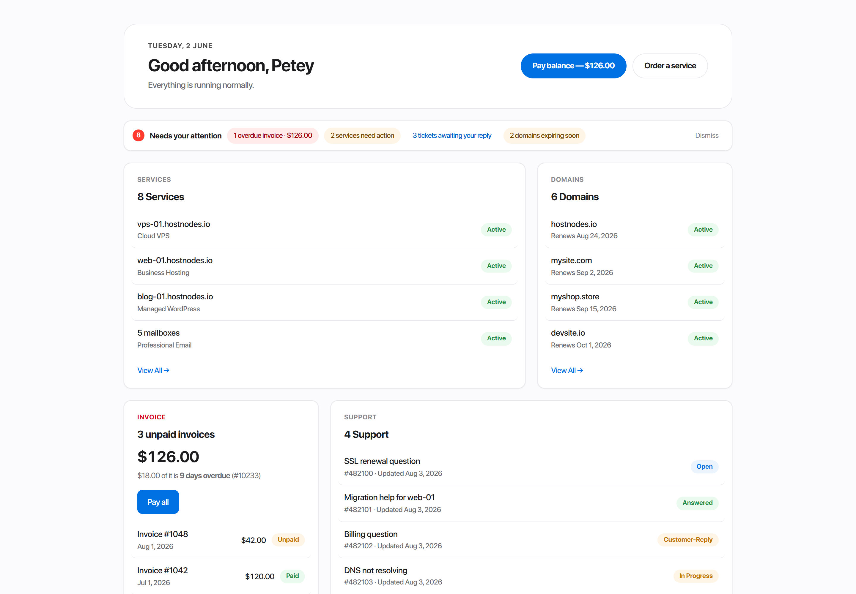
Two things are Bento's own: an attention strip that lifts the few things needing action out of the many rows, and an identity card beside the greeting.
Minimal
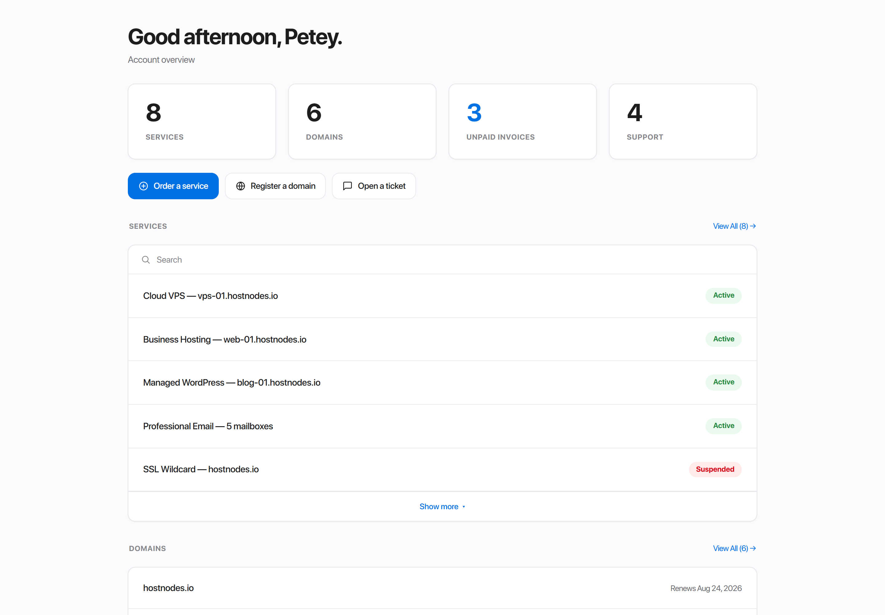
A quieter dashboard: greeting, four summary tiles, quick actions, then services, domains, invoices, tickets and announcements as plain rows on one surface. No panel grid or account sub-nav aside.
Choosing between them
| Default | Atrium | Bento | Minimal | |
|---|---|---|---|---|
| Blocks you can arrange | - | 11 | 9 | 7 |
| Width means | - | which column | size on a grid | size on a grid |
| Welcome band | - | yes | yes | - |
| Attention strip | - | - | yes | - |
| Long lists collapse behind "Show more" | - | - | - | yes |
| Blocks can be coloured | - | yes | yes | the two optional ones |
The block builder
Atrium, Bento and Minimal each carry a builder card under Template settings - Dashboard tiles on Atrium and Bento, Dashboard sections on Minimal. It is the same control in all three, offering that template's own blocks.
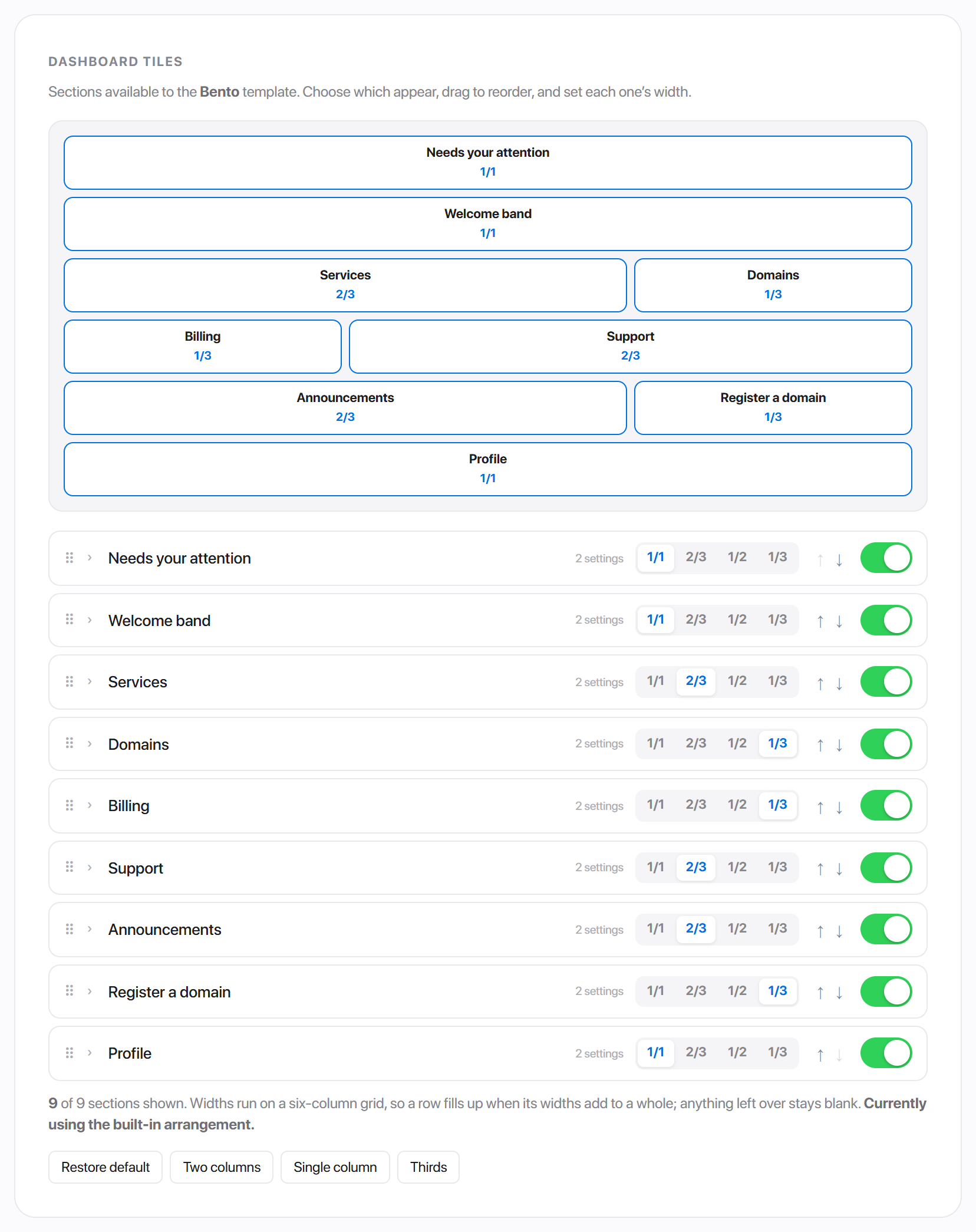
Arranging blocks
- 1Drag a row by its handle to reorder it, or use the up and down arrows.
- 2Switch a block off with the toggle at the end of its row to hide it.
- 3Click a width to set how much of the row that block takes.
- 4Click a block's name to open its own settings.
- 5Save changes.
The preview at the top of the card redraws as you go, so you can see the arrangement before you save.
Four presets sit under the list - Restore default, Two columns, Single column and Thirds - as starting points.
What width means
This is the one place the three templates genuinely differ.
Bento and Minimal run a six-column grid. A row fills up when its widths add to a whole, and anything left over stays blank.
| Width | Takes |
|---|---|
| Full width | the whole row |
| Two thirds | four of six columns |
| One half | three of six columns |
| One third | two of six columns |
Atrium has no grid. Its body is one wide column and one narrow one, so a width assigns the block to a column instead of sizing it:
| Width | Puts the block |
|---|---|
| Full width | across the top, above the split |
| Main column | in the wide left stack |
| Side column | in the narrow right stack |
Reordering an Atrium block therefore moves it within its own column.
Block settings
Click a block's name and its drawer opens.
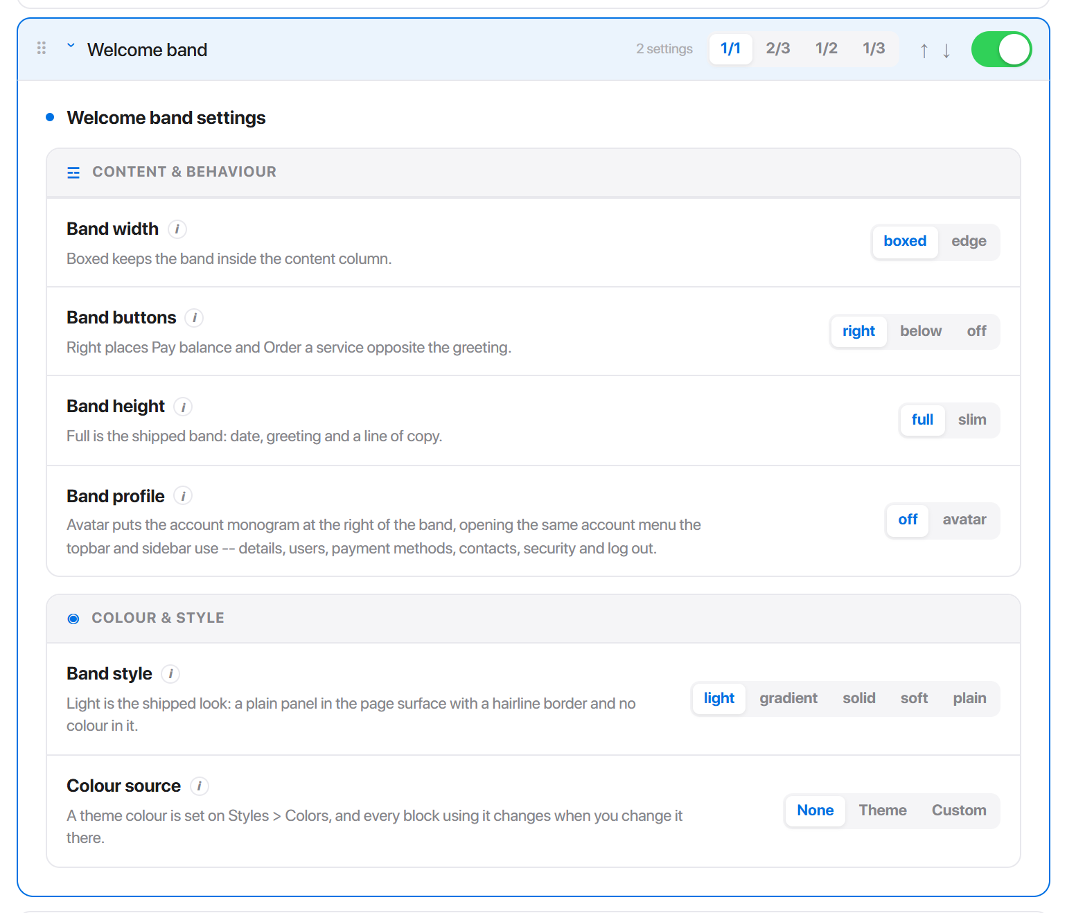
Which controls appear depends on the block. A block that lists something offers Items shown; a block that can be painted offers Colour source and a Fill. Drawers group their controls under Content & behaviour and Colour & style.
| Control | Default | What it does |
|---|---|---|
| Items shown | page default | How many rows this block lists before its View all link takes over. 1 to 8; blocks hold at most 8. |
| Compact rows | off | Name and status only, with no second line - a dense list you can scan in one pass. |
| Colour source | None | None leaves the block plain. Theme follows a colour from Style Manager. Custom fixes one. |
| Fill | solid | How the colour is laid on: a solid panel, a pale wash, or a gradient. |
The Welcome band
Atrium and Bento open with a greeting band. It is a block like any other - reorder it, switch it off, colour it - and it holds five settings of its own in its drawer. Minimal has no band.
| Setting | Default | What it does |
|---|---|---|
| Band style | light | light is a plain panel with a hairline border and no colour. gradient fills it with the accent, deepened at one end. solid is a flat accent panel. soft is a pale tint. plain drops the panel and sets the greeting on the page background. |
| Band width | boxed | boxed keeps the band inside the content column; edge runs it the full width of the content area, which reads as a header rather than a card. |
| Band buttons | right | right places Pay balance and Order a service opposite the greeting; below stacks them under it; off hides them. |
| Band height | full | full is date, greeting and a line of copy. slim drops the copy line for a one-line bar. |
| Band profile | off | avatar puts the account monogram at the right of the band, opening the same account menu the topbar uses. |
off if you want the avatar alone at the right of the band.gradient, solid and soft are built from a colour, so they always carry one and the drawer withholds None. light and plain are neutral by definition.
Blocks each template offers
Atrium - 11 blocks. Welcome band, Summary figures, Services, Domains, Recent invoices, Announcements, Amount due, Account credit, Payment methods, Support, Quick actions.
Bento - 9 blocks. Welcome band, Needs your attention, Services, Domains, Billing, Support, Announcements, Register a domain, Profile.
Minimal - 7 blocks. Services, Domains, Recent invoices, Support, Announcements, Register a domain, Profile. The last two arrive switched off on an arrangement saved before they existed; switch them on to use them.
A few blocks carry extra switches in their drawer. Summary figures (Atrium) can turn each of its four figures on or off and drop the sub-lines under them. Quick actions (Atrium) can hide any of its four links - worth turning off Register a domain on an install that does not sell domains. Recent invoices can drop its list and stay an aggregate: what is owed and how overdue it is.
Dashboard settings
These sit in the Template settings panel itself, above the builder.
Atrium has one:
| Setting | Default | What it does |
|---|---|---|
| Block titles | inside | inside keeps each block self-contained, its label on the card. outside floats the label on the page background above the card, so a column reads as labelled groups rather than boxes. |
Bento has four:
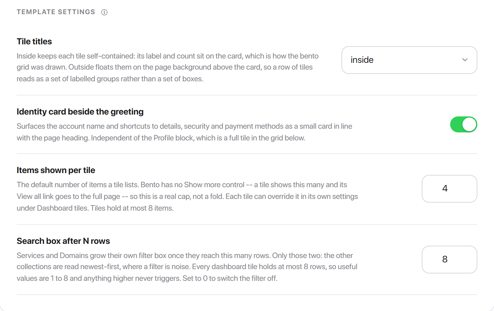
| Setting | Default | What it does |
|---|---|---|
| Tile titles | inside | As Atrium's Block titles - label and count on the card, or floated above it. |
| Identity card beside the greeting | on | Surfaces the account name and shortcuts to details, security and payment methods as a small card in line with the page heading. Independent of the Profile block. |
| Items shown per tile | 4 | The default number of items a tile lists. Bento has no Show more control, so this is a real cap, not a fold. Each tile can override it in its own drawer. |
| Search box after N rows | 8 | Services and Domains grow their own filter box once they reach this many rows. Useful values are 1 to 8; 0 switches the filter off. |
Minimal has five:
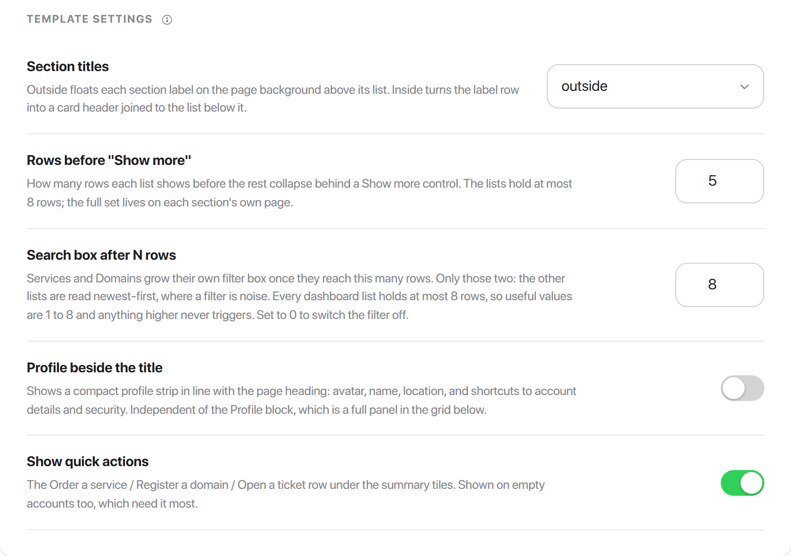
| Setting | Default | What it does |
|---|---|---|
| Section titles | outside | outside floats each label on the page background above its list; inside turns the label row into a card header joined to the list. |
| Rows before "Show more" | 5 | How many rows each list shows before the rest collapse. Lists hold at most 8. |
| Search box after N rows | 8 | As Bento's. |
| Profile beside the title | off | A compact profile strip in line with the page heading: avatar, name, location, and shortcuts to account details and security. |
| Show quick actions | on | The Order a service / Register a domain / Open a ticket row under the summary tiles. Shown on empty accounts too, which need it most. |
0 to switch it off rather than to a large number.Homepage
The public landing page, rendered at your site root for visitors who are not signed in. Two templates.
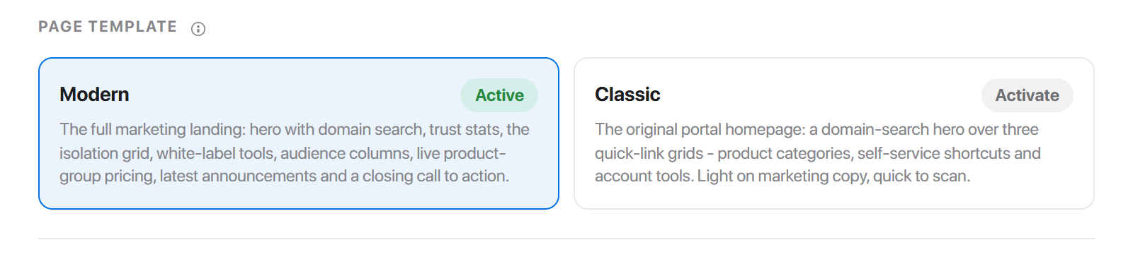
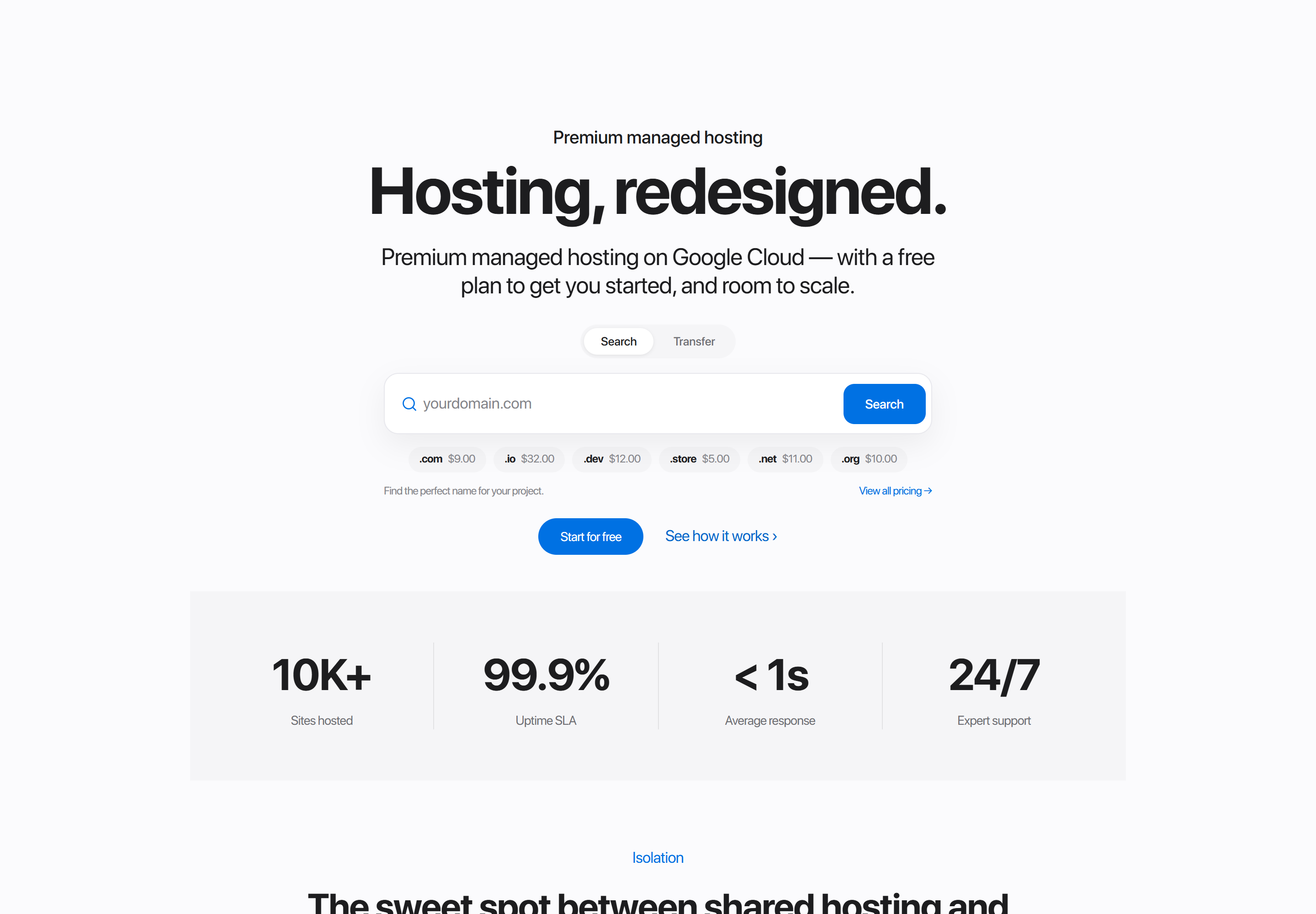
Modern
The full marketing landing: hero with domain search, trust stats, the isolation grid, white-label tools, audience columns, live product-group pricing, latest announcements and a closing call to action.
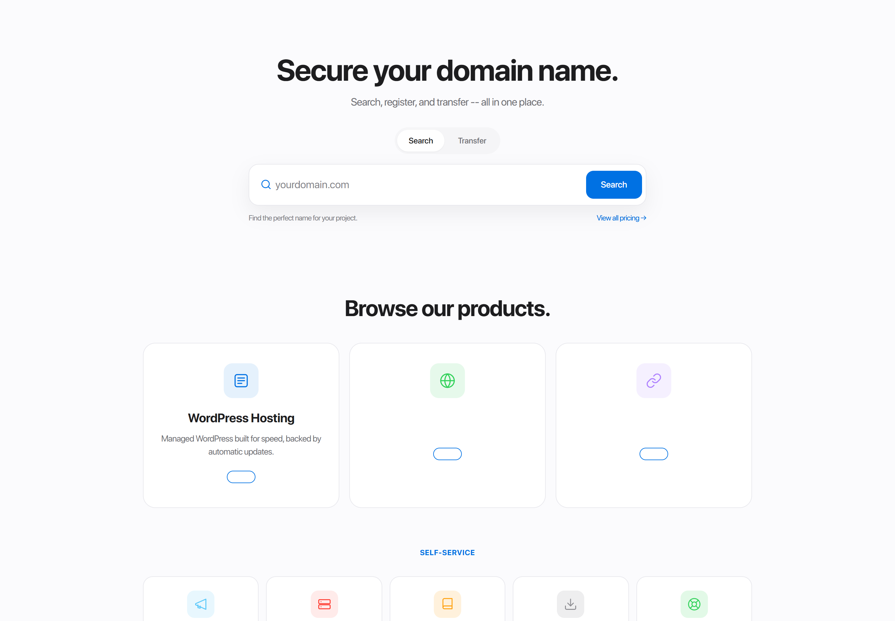
Classic
The original portal homepage: a domain-search hero over three quick-link grids - product categories, self-service shortcuts and account tools. Light on marketing copy, quick to scan, and aimed at visitors who already know what they came for.
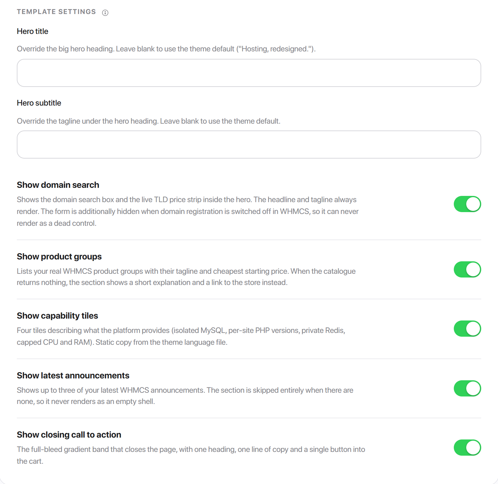
Homepage settings
These seven belong to the page, so they apply whichever template is active.
| Setting | Default | What it does |
|---|---|---|
| Hero title | theme default | Overrides the big hero heading. Blank uses the theme's own. |
| Hero subtitle | theme default | Overrides the tagline under the heading. |
| Show domain search | on | The domain search box and live TLD price strip inside the hero. The heading and tagline always render. |
| Show product groups | on | Lists your real WHMCS product groups with their tagline and cheapest starting price. |
| Show capability tiles | on | Four tiles describing what the platform provides. Static copy from the theme language file. |
| Show latest announcements | on | Up to three of your latest WHMCS announcements. |
| Show closing call to action | on | The full-bleed gradient band that closes the page - one heading, one line of copy, one button into the cart. |
Sign in
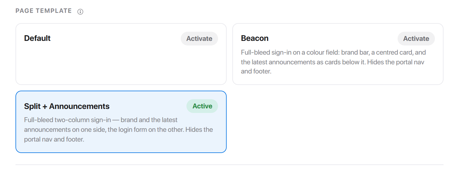
Three templates. Two of them are full-bleed: they take over the whole window and hide the navigation and footer.
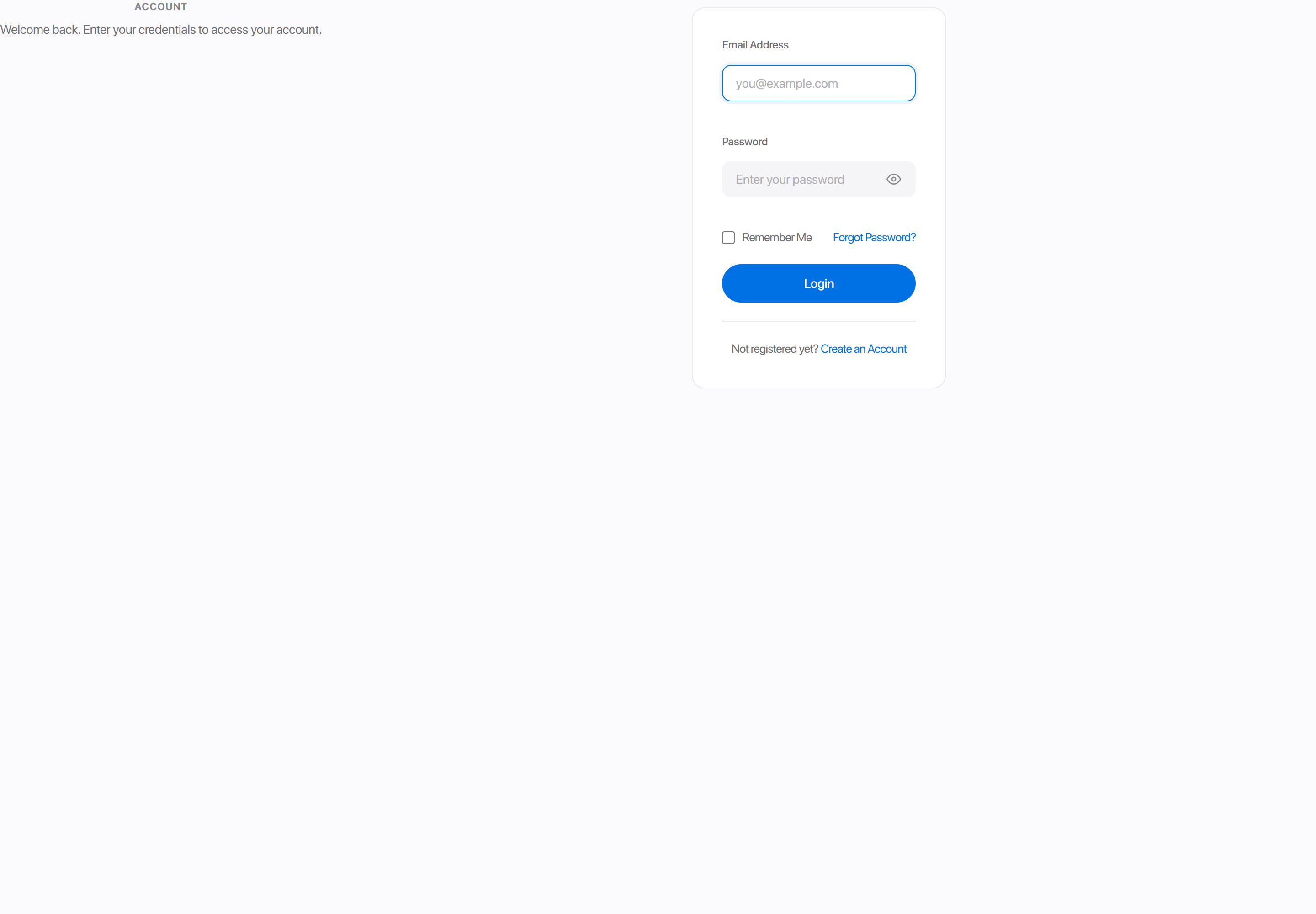
Default
The centred sign-in card on the ordinary portal chrome - navigation above, footer below.
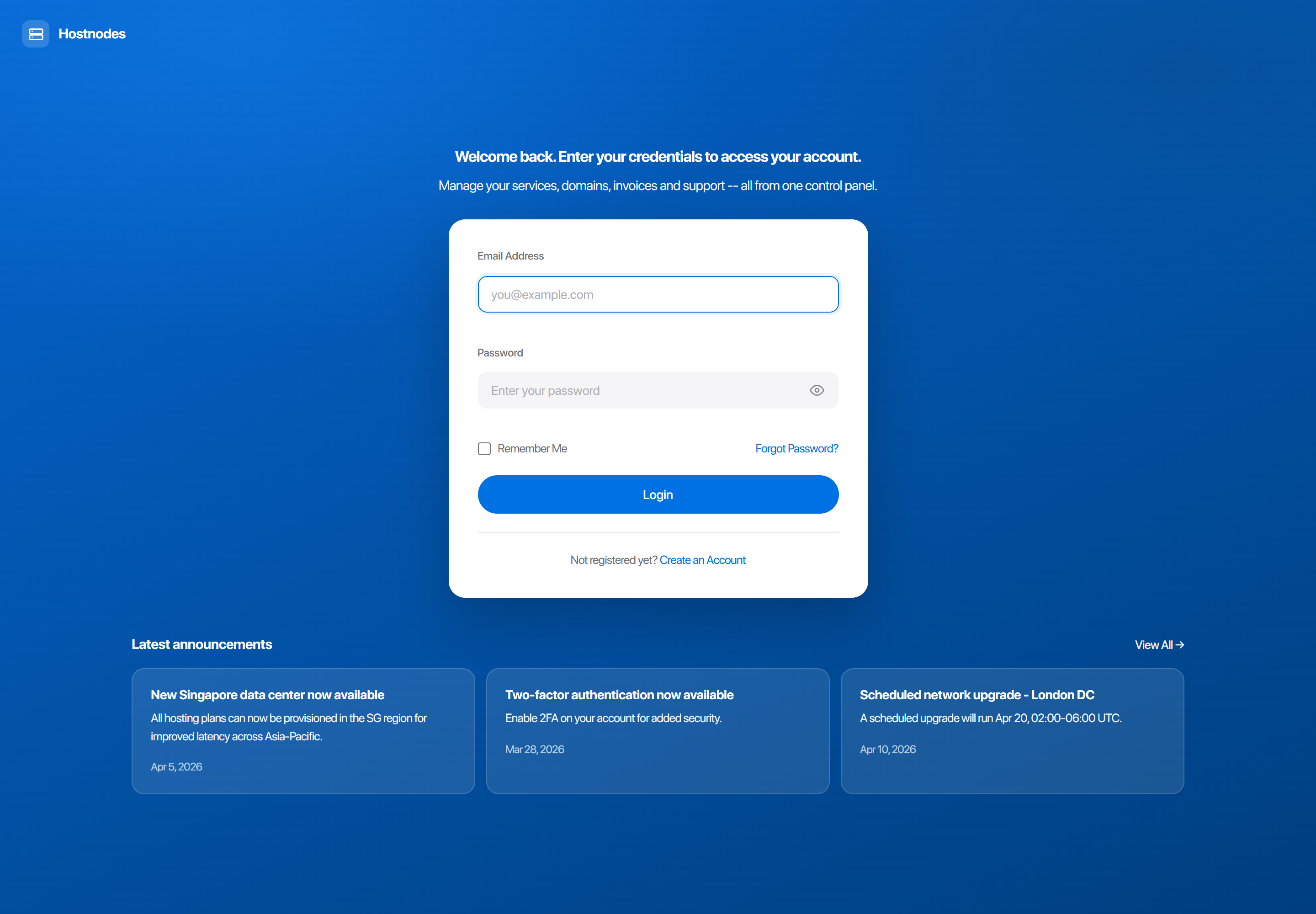
Beacon
Full-bleed sign-in on a colour field: brand bar, a centred card, and the latest announcements as cards below it.
| Setting | Default | What it does |
|---|---|---|
| Field style | gradient | gradient sweeps the accent across the page, deepened at one corner. solid is a flat accent field. soft is a pale tint with dark text. light drops the colour and puts the card on the page surface. |
| Field colour | Theme | Which colour the field is built from. See below. |
| Show announcements | on | The three most recent published announcements, as cards under the sign-in card. Off leaves the card alone on the field. |
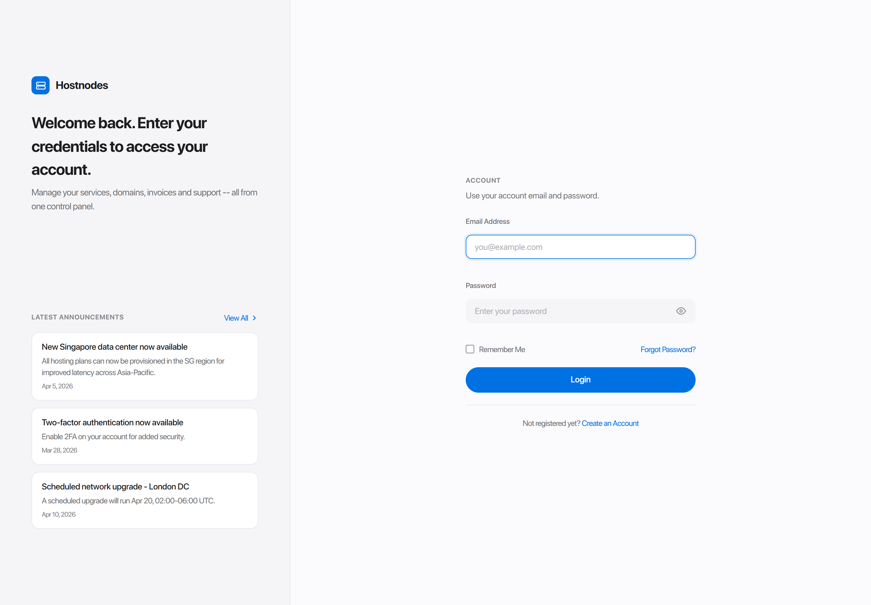
Split + Announcements
Full-bleed two-column sign-in - brand and the latest announcements on one side, the login form on the other.
| Setting | Default | What it does |
|---|---|---|
| Panel style | light | light is the page surface with a hairline divider. soft is a pale tint of the accent. gradient sweeps the accent down the panel. solid is a flat accent panel. Gradient and solid carry light text; light and soft keep the page ink. |
| Panel colour | Theme | Which colour the panel is built from. See below. |
Field and panel colour
Beacon's Field colour and Split's Panel colour are the same control, and the same one the block builder uses.
- Theme follows a colour from Style Manager, so the sign-in page moves with a preset change.
- Custom fixes one colour that does not move.
- None falls back to the theme accent.
None disappears while the style beside it is one built from a colour - Beacon's gradient, solid and soft, and Split's soft, gradient and solid. A field swept with a gradient has no uncoloured reading, so the control does not offer one.
Settings shared by all three
| Setting | Default | What it does |
|---|---|---|
| Full Page | off | Hides the standard navigation and footer. See below. |
| Show Logo | on | Shows the brand logo at the top of the page. |
| Info panel on the right | off | Split only: puts the brand and announcements panel on the right and the form on the left. |
Info panel on the right belongs to the page rather than to one template, so it stays on screen while Default or Beacon is active - where it has nothing to move.
Full-page mode
A full-page template fills the window: the navigation, the sidebar or icon rail, the breadcrumb and the footer are all suppressed. The cookie notice and the back-to-top control still render.
Beacon and Split + Announcements declare it themselves, so they are always full-bleed and the Full Page toggle is already implied. On the Default sign-in template the toggle is yours to set.
Every other page
Around a hundred pages ship exactly one template and no template settings. An empty Template settings panel on those pages is correct, not a fault - there is simply nothing that page offers to choose between.
Order Process pages - Products, Configure Product, View Cart, Checkout - have no template cards at all, because the order form renders from its own template rather than from the theme's page directory.
Those pages are still configurable: SEO, visibility, sub-navigation and per-page layout overrides all live in Page Manager. If you want to change what one of them actually renders, you can add a template of your own or replace the page outright.