
Style Manager
Recolour and restyle the whole client area from one screen. Pick a preset, generate a palette from a single brand colour, or edit any of the 60 design tokens by hand - no template files, no CSS knowledge required.
Introduction
Hadrian is built entirely on CSS custom properties. Every colour, font size, radius and border in the client area resolves to a named token, and the Style Manager is the editor for those tokens.
Two things follow from that, and both are worth knowing before you change anything:
- Only tokens you actually change are stored. Editing one value does not freeze the other 59. Anything you leave alone keeps tracking the preset, so a theme update that improves a default still reaches you.
- Changes apply site-wide, immediately. There is no publish step; the tokens are written into the page head on the next request.
The style editor
Open Hadrian -> Styles, then Customize on the style you want to work on. The screen has three fixed parts.
Tabs

Style Variables holds everything token-based - the six sub-sections below. Custom CSS is a plain editor for rules the token system does not reach.
Sub-sections
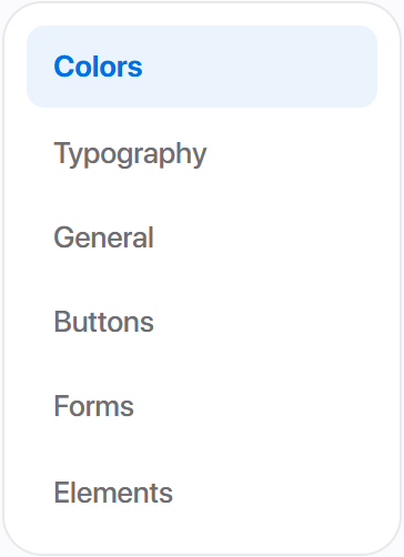
Colors and Typography are stored per style preset. General, Buttons, Forms and Elements are stored once and shared by every preset - changing a button radius changes it whichever style is active.
The save bar
Pinned to the bottom of the window and always visible. It carries Cancel, Restore defaults on the left, and a save button named for the section you are in - Save changes, Save typography, Save buttons, and so on.
Colors
Light / Dark scope

Colors edits one scope at a time. This toggle chooses which - it does not preview your site in dark mode. Every control below writes into the scope selected here.
Whether visitors ever see the dark palette is a separate setting under Settings -> Appearance.
Quick presets

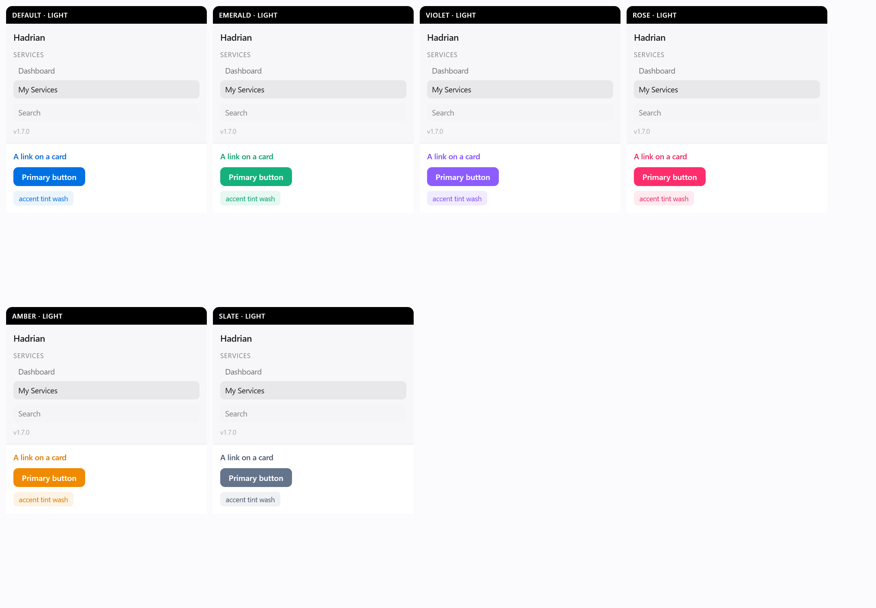
Default, Emerald, Violet, Rose, Amber and Slate. Clicking one cascades the brand fields - accent, accent hover, accent tint and link - and leaves every other token alone. They are a starting point, not a lock: tweak any value afterwards.
Generate from one colour
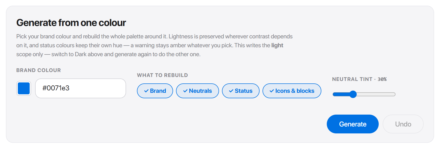
If no preset matches your brand, build a whole palette from one hex value.
- 1Enter your brand colour in BRAND COLOUR, or pick it with the swatch.
- 2Under WHAT TO REBUILD, choose which families to touch - Brand, Neutrals, Status, Icons & blocks. Anything you deselect keeps its current values.
- 3Adjust NEUTRAL TINT to warm the greys toward your brand hue, or leave it for pure neutrals.
- 4Press Generate, then Save changes.
Two behaviours are deliberate and surprise people:
- Lightness is preserved wherever contrast depends on it. The generator will not hand you a palette that fails to read.
- Status colours keep their own hue. A warning stays amber whatever brand colour you pick, because a red warning and a green warning mean different things to a customer.
Brand
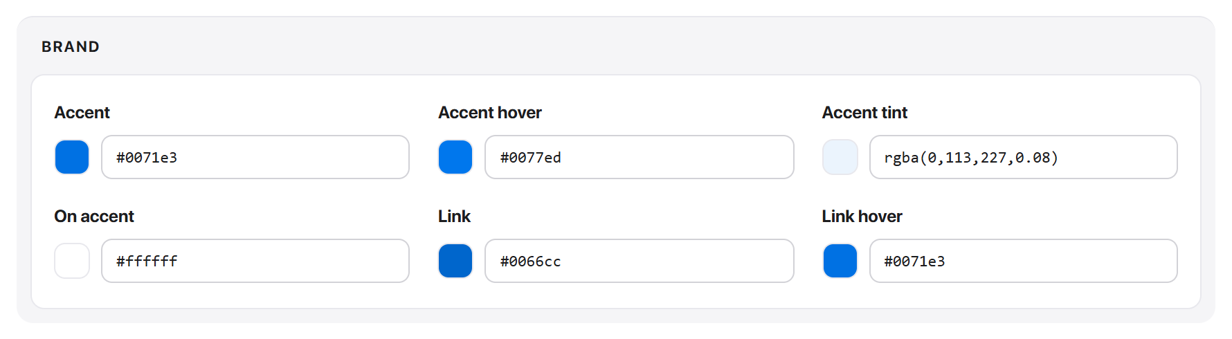
The accent and everything derived from it. Accent is the single colour that marks the one primary action per view; Accent tint is its translucent wash, used behind active rows and info callouts. On accent is the text colour that sits on a filled accent button - change the accent to a pale colour and this needs to go dark.
Surfaces
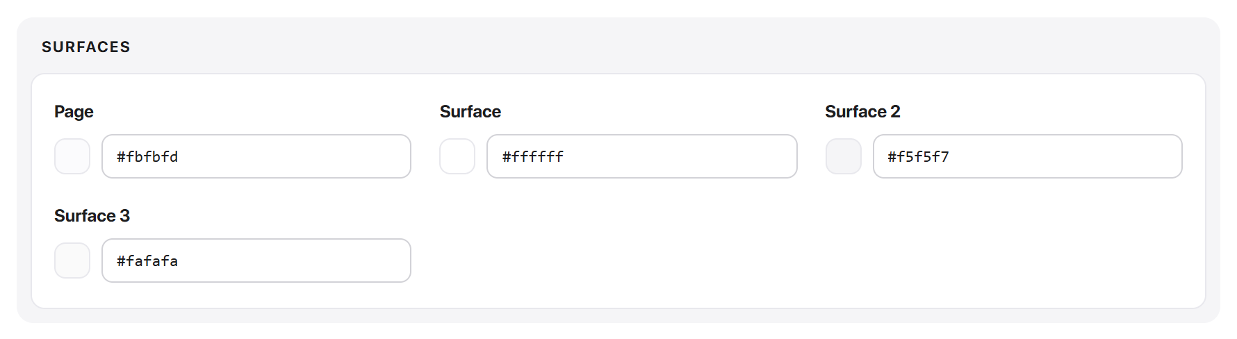
Page background and three levels of card. Page is the body; Surface is a card on it; Surface 2 and Surface 3 are for panels nested inside cards, such as a table header inside a card.
Text
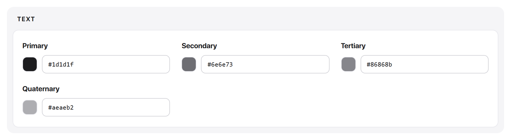
Four levels of ink. Primary for headings and body, Secondary for supporting copy, Tertiary for captions and metadata, Quaternary for disabled or de-emphasised text.
Page or Surface substantially, check the text levels still read.Borders

Border is the default line for inputs and dividers, Border light a softer one for subtle separators, and Card border the translucent outline around cards.
Status & badges
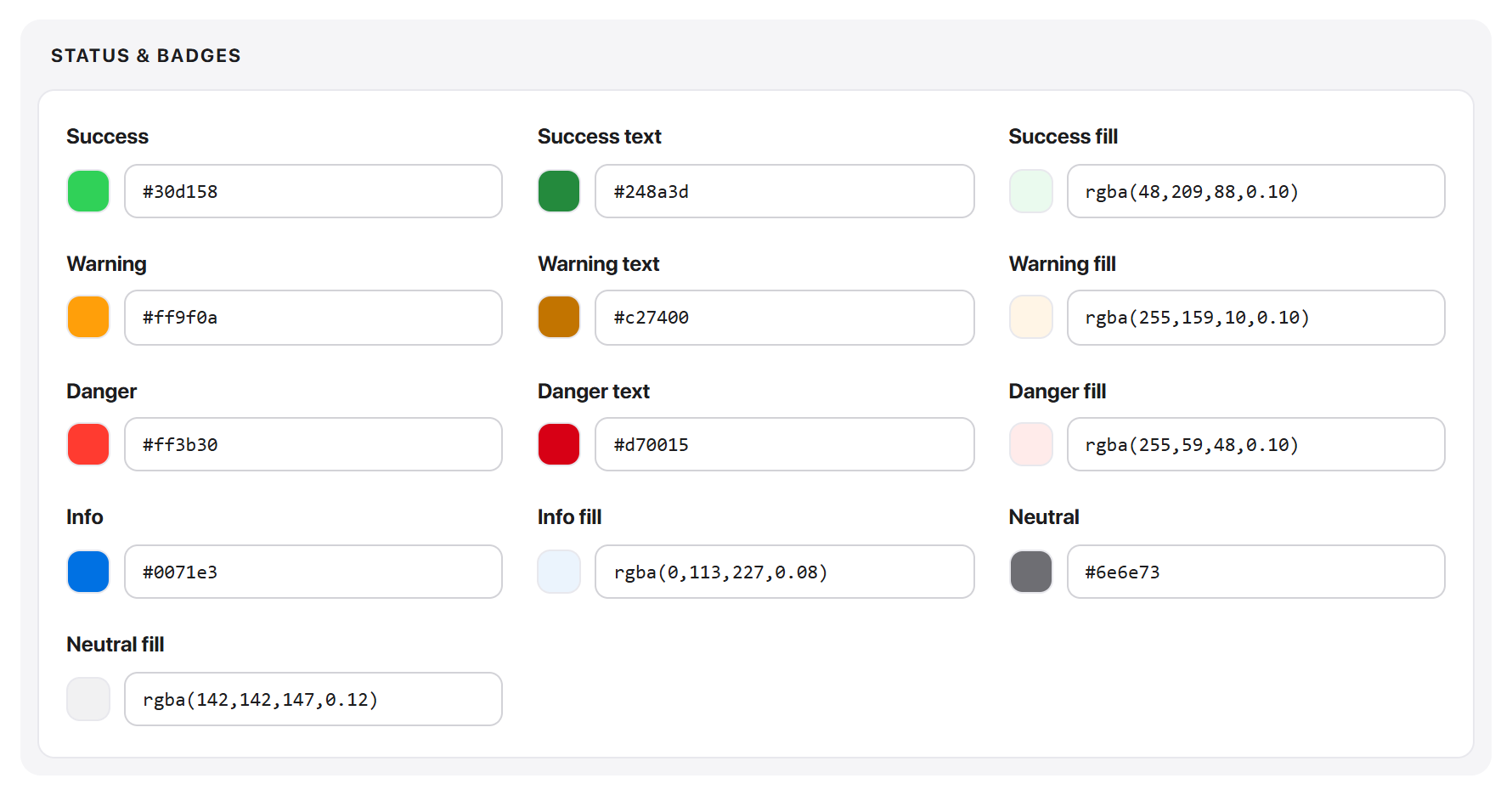
Success, Warning, Danger, Info and Neutral, each with three tokens: the solid colour, a text variant tuned to read on a light tint, and a translucent fill for the badge background. These drive invoice states, service status pills and alerts.
text and fill variants are separate tokens so the pair can hit AA contrast. Recolouring only the solid one leaves badges in the old hue.Navigation & bars
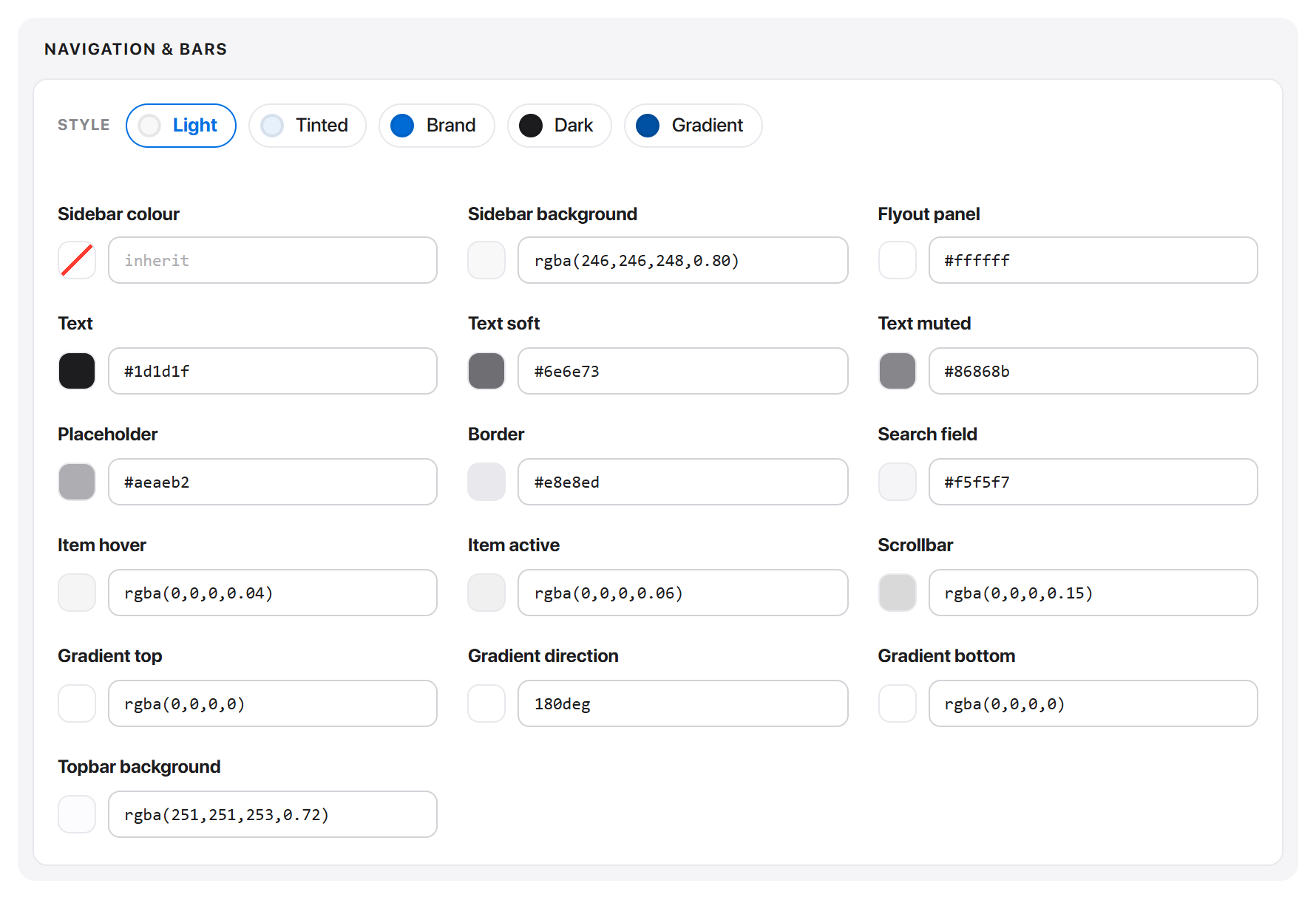
The whole navigation shell - sidebar, topbar, flyout panel, item hover and active states, scrollbar.
The STYLE row at the top is a shortcut: Light, Tinted, Brand, Dark and Gradient each write a coordinated set of sidebar tokens in one click. The individual rows below stay editable afterwards, so a named style is a starting point too.
Icons & avatars
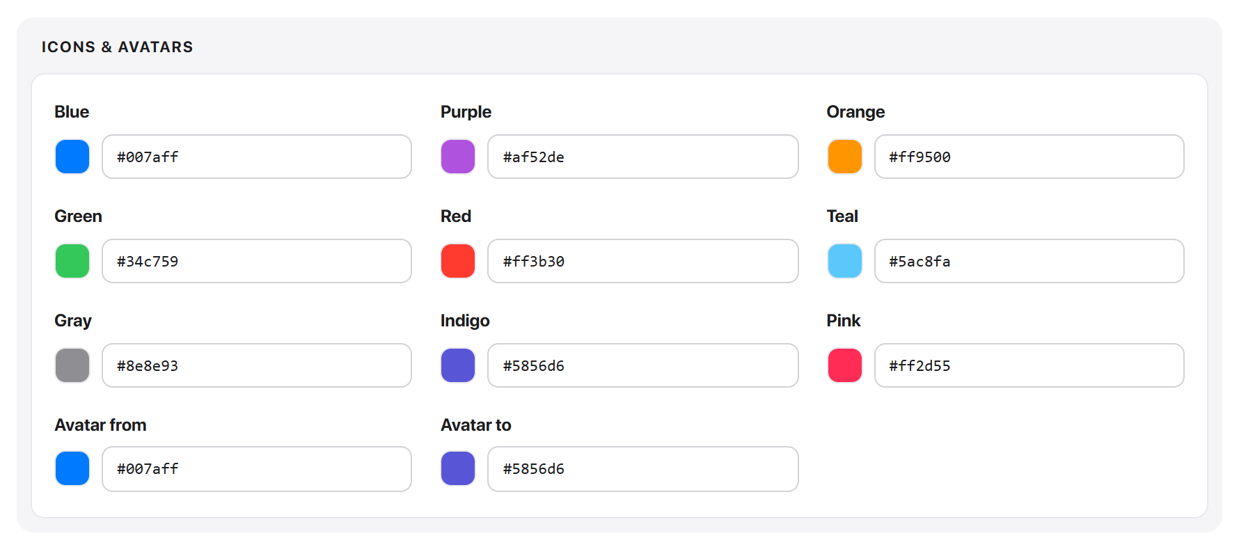
Nine named hues used for service and product icons, plus the two-stop gradient behind client avatars. These are deliberately not derived from your accent - a row of icons in nine shades of one colour is harder to scan than nine distinct hues.
Block accents

Three accents used by dashboard block headers, so adjacent blocks can be told apart at a glance.
Reset to the shipped palette
Under the presets there is a Reset to the Default preset link. It discards your colour edits for the current style and restores what it shipped with.
Typography
Font Family
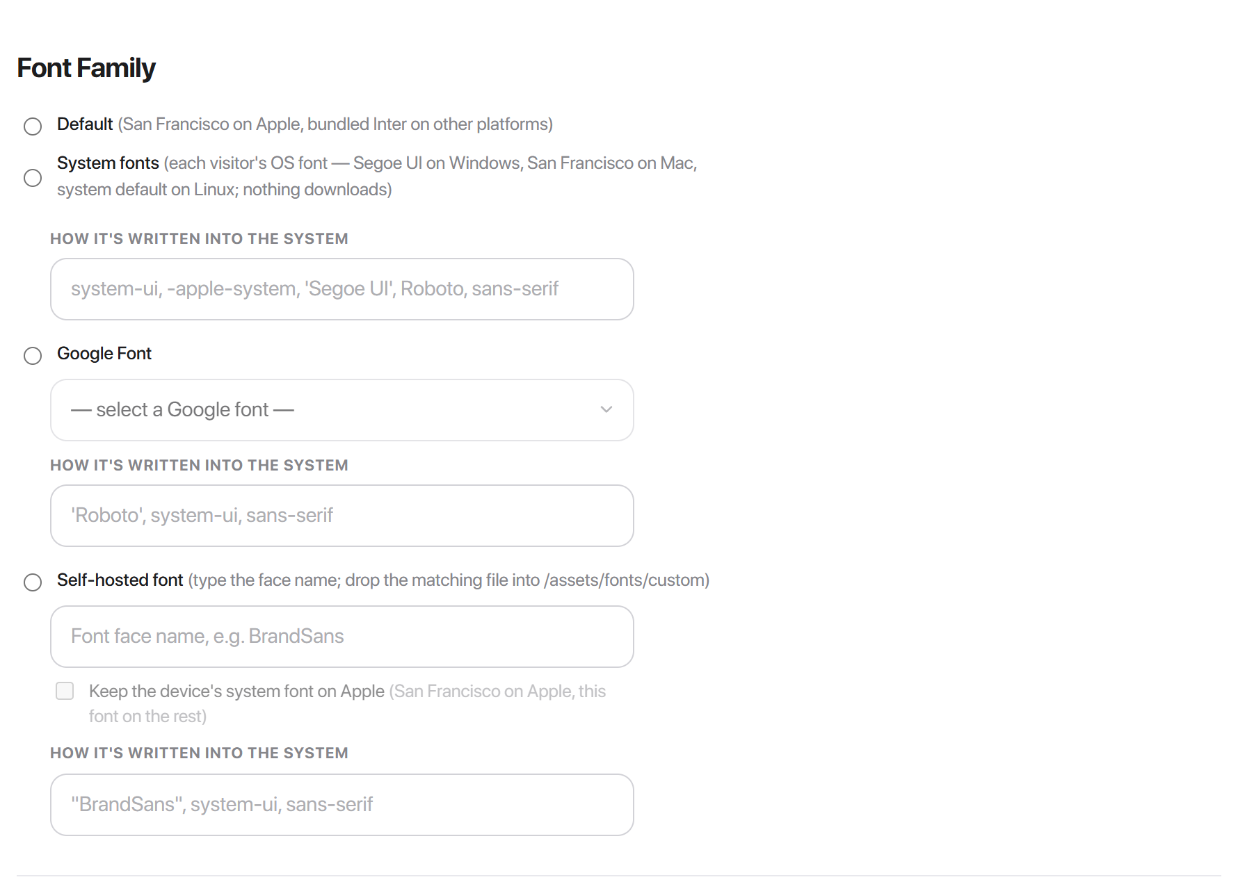
One typeface is applied across the whole client area - there is no separate heading face. Pick one of four modes. They differ in what gets loaded (a network request, or none) and what gets written into the --font-family token.
| Mode | Loads | Where from |
|---|---|---|
| Default | Nothing | Bundled with the theme |
| System fonts | Nothing | The visitor's own device |
| Google Font | One stylesheet, five weights | fonts.googleapis.com |
| Self-hosted font | One font file | Your own domain |
Default

The shipped stack, and the only mode that writes no token at all - the value already in the theme's stylesheet stands.
That value asks for San Francisco first, so Apple devices use their system face. Everywhere else it falls through to Inter, which ships inside the theme and is already declared, so nothing is fetched over the network.
-apple-system, BlinkMacSystemFont, 'SF Pro Display', 'SF Pro Text',
'Inter', 'Segoe UI', Roboto, ... , sans-serif
Leave it here unless you have a brand typeface. It is the fastest of the four and looks native on Apple hardware.
System fonts
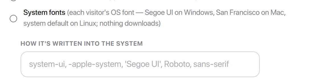
Every visitor sees their own operating system's interface font. Segoe UI on Windows, San Francisco on Mac and iOS, the system default on Linux.
system-ui, -apple-system, 'Segoe UI', Roboto, sans-serifsystem-ui is the modern keyword for "whatever this OS uses for its own interface". -apple-system follows it only as a backstop for older Safari.
No <link> and no @font-face are emitted, so nothing downloads at all.
The difference from Default is narrow but real: Default prefers Inter on Windows and Linux, giving you the same face across non-Apple platforms; System fonts gives each platform its own.
Google Font
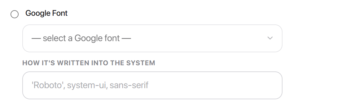
Choose from twelve curated families: Inter, Roboto, Open Sans, Lato, Poppins, Montserrat, Nunito Sans, Work Sans, Manrope, DM Sans, Source Sans 3 and Plus Jakarta Sans.
Selecting one emits three tags into every client-area page - two preconnects and the stylesheet:
<link rel="preconnect" href="https://fonts.googleapis.com">
<link rel="preconnect" href="https://fonts.gstatic.com" crossorigin>
<link rel="stylesheet" href="https://fonts.googleapis.com/css2?family=Poppins:wght@300;400;500;600;700&display=swap">
Three details are worth knowing:
- Five weights are fetched - 300, 400, 500, 600 and 700. That covers the whole Hadrian type scale, so no weight falls back to a synthesised bold.
display=swapmeans text is painted immediately in the fallback face and swapped when the font arrives. Nothing is ever invisible while loading.- The token becomes
'Poppins', system-ui, sans-serif- your font, then the visitor's own OS font if it fails to load.
fonts.googleapis.com and fonts.gstatic.com. If your privacy policy or a GDPR assessment rules out third-party requests, use Self-hosted font instead - the same typeface, served from your own domain.Self-hosted font
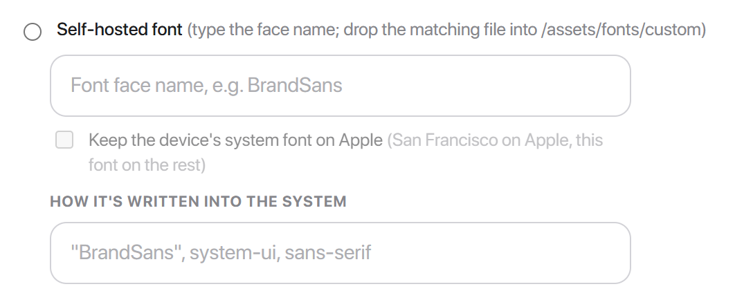
Your own typeface, served from your own server. No third-party request.
- 1Upload the font file to
/templates/hadrian/assets/fonts/custom/on your server. - 2Type the face name into the field. It must match the filename exactly -
BrandSans.woff2means typingBrandSans. - 3Save typography.
Hadrian looks for woff2, woff, ttf and otf, in that order, and uses the first one it finds. Then it writes the @font-face for you:
@font-face {
  font-family: "BrandSans";
  font-style: normal;
  font-weight: 100 900;
  font-display: swap;
  src: url("/templates/hadrian/assets/fonts/custom/BrandSans.woff2") format("woff2");
}font-weight: 100 900, which is correct for a variable font and wrong for a static one. Upload a variable file if you have it. With a static single-weight file the browser will synthesise the other weights, and bold text will look smeared.Keep the device's system font on Apple is offered on this mode only. Ticking it puts -apple-system, BlinkMacSystemFont at the front of the stack, so Apple devices keep San Francisco and your face is used everywhere else - useful when your brand font exists mainly to replace the plain Windows default.
How it's written into the system
Each mode shows this field beneath it. It is editable, not a preview: whatever it contains is exactly what gets written to --font-family.
The two halves are independent. The radio button decides what gets loaded - the Google stylesheet, the @font-face, or nothing. This field decides what gets applied. That is what lets the Apple-first trick work: the font still downloads, but the stack asks for San Francisco first, so only non-Apple devices ever use it.
Edit it if you need a fallback the defaults do not give you - a specific CJK face, say, or a monospace stack. Only letters, digits, spaces, commas, quotes and hyphens are kept; anything else is stripped on save.
Font Size and Font Weight
Below Font Family, these expose the type scale. Each step is its own token - --text-xs through --text-2xl - so you can change one size without shifting the rest.
General, Buttons, Forms and Elements
The remaining sub-sections cover component variables. They behave alike: colours are picked from the palette you already set, so they follow your accent and dark mode automatically, and only values you change are saved.
| Section | What it controls |
|---|---|
| General | Shared UI variables - the radius, spacing and shadow steps used across components |
| Buttons | A size tier per button scale (font size, weight, line height, radius) plus per-variant colours. Height follows the font size automatically |
| Forms | Input, select and textarea sizing, and the colours for field, border, placeholder and focus |
| Elements | Remaining component variables not covered above |
Custom CSS
The Custom CSS tab takes hand-written CSS, saved with the theme and loaded on every client-area page. Use it for anything the token editor does not reach.
Write against the tokens rather than fixed values, and your rules keep working when the palette changes or a visitor switches to dark:
/* Follows the accent and the active palette */
.my-promo-banner {
  background: var(--color-accent-light);
  border: 1px solid var(--color-border);
  color: var(--color-text-primary);
  border-radius: var(--radius-lg);
}background: #ffffff stays white in dark mode and renders white-on-white. var(--color-surface) flips with the mode.To find the token behind any element, open your browser's developer tools, inspect it, and read the custom property in the Styles panel.
Common problems
A colour change did nothing
Three usual causes, in order of likelihood:
- You saved the wrong section. Colours are saved by Save changes in Colors, not by Save typography.
- You edited the wrong scope. Check the EDITING Light / Dark toggle matches the mode you are viewing.
- A Custom CSS rule is overriding the token. Custom CSS loads after the token block, so it wins.
Dark mode looks wrong after generating
Generate writes only the scope selected in the toggle above it. Switch EDITING to Dark and generate again.
Custom CSS is white-on-white in dark mode
A hard-coded colour. Replace it with the matching token - see the warning under Custom CSS.
Badges are the wrong colour after a recolour
Each status has three tokens - solid, text and fill. Changing only the solid one leaves the badge background and label behind. See Status & badges.
Everything needs to go back
Reset to the Default preset in Colors restores the colour tokens; Restore defaults in the save bar restores the section you are in. Neither can be undone.